

The How-To of Some of the
AI Generated Images Used on This Site
Bear with me folks, this is a long one, but worth it if you are looking to learn more about AI generated art. The scary thing is that it took me far longer to write this article than it did to create all of the artworks combined!
I have a lot of ethical concerns about AI generated art, especially given the amount of data that it was trained on that artists were neither asked permission nor compensated for use of their protected works. Part of the great success of the AIs has hinged on its training data from those artists and those AI companies are profiting off of pirating protected works. I have a lot of artists in my life and many have seen income streams drying up since the advent of AI generated art.
I generally prefer to use art and photography from other sources that I can license or use freely with appropriate attributions in my work. And that's the same for this blog. However, it was a good opportunity to test out these technologies and explore them. Given my roles as an educator as well as a technologist, it's important for me to understand what is out there and is happening with them; particularly in providing some feedback and guidance to other faculty and administrators. These tools have advanced dramatically in a very short period of time -- less than a year!
Some of the articles on EdutainAI have used AI-produced art to explore and demonstrate some of the capabilities of the current tools available. This isn't going to be a comprehensive review of them all. I've yet to use Midjourney as it is integrated into Discord, and I'm also trying to focus on using the free online tools that are easiest for others to access and assess themselves.
You'll be surprised that some these images were produced in only minutes using one tool. And others required more processing to achieve my vision. A few on this site are used as produced by the tool with nothing more than cropping or placing on a wider background. Others took a bit more work to get the results I was after.
In addition, my campus celebrates diversity, equity, and inclusion. The early AI image generators were notoriously biased and usually created images of white people, and often of men if a gender wasn't specified. Female renderings also tended to be white and hypersexualized. There was a great deal of early bias and largely due to the training data. This was also an opportunity to explore through some personal experience how much better it has gotten with these issues.
My efforts so far for this site have centered on ImageFX and Bard / Copilot Designer. The only drawback to these is that they produce square images. That may be fine for many purposes, but this blog works best with landscape 16:9 aspect ratio images. So, a little graphics editing is required for most of them.
I realize that Adobe Photoshop could do much of what I needed here. However, it would be even better if our District licensing included some of the newer AI tools, which is does not, because there are a lot of additional AI tools "baked in".
And while I could also use Krita or another open source graphics editor, I own an ancient copy of Macromedia Fireworks which is optimized for doing 90% of what I need that I used instead. Technically, you can use anything, even Paint or Pixelmator to do most of the things I describe. So, I'll just refer to it as a "Graphics Program" and you'll know you can use whatever program you are most comfortable with.
And while I could also use Krita or another open source graphics editor, I own an ancient copy of Macromedia Fireworks which is optimized for doing 90% of what I need that I used instead. Technically, you can use anything, even Paint or Pixelmator to do most of the things I describe. So, I'll just refer to it as a "Graphics Program" and you'll know you can use whatever program you are most comfortable with.
ImageFX
I've liked many of the results produced by Google's new ImageFX engine; powered by Google’s Imagen 2. It uses Google DeepMind’s novel watermarking technology, SynthID to embed a digital watermark in the outputs. So, it's nice to see an important development to help identify AI-generated content -- at least when it comes to art.
Art for The Impact of AI on the Comic Industry
Our campus has a very large Latinx student, faculty, and admin population. Also, comics is notoriously a male dominated industry. As a result, I used the following prompt to generate my image:
a robotic young hispanic woman drawing a comic
I got several great images, but the original is the one below:

Because of the composition of this image, I knew I could crop it to a landscape image. However, it wouldn't be exactly 16:9. But it displayed as I wanted it to in the blog, so it was close enough. And that resulted in the final image below:

Art for What Happens When Good A.I. Turns to the Dark Side?
One of the key elements of this podcast is that a safety test of an AI that generated chemical structures was easily capable of creating new types of deadly nerve agents, I decided to go with the following prompt after a little refinement:
simple ribbon and string single protein model that fills the frame with an ominous 3D skull and crossbones in the center foreground that glows a sickly green
This resulted in the original image below:

That one was perfect, except for the fact that it was square. It was clear in my graphics program that just putting it on a solid background wouldn't quite work (and I've found that extending images often leads to hallucinations by AI when there's not much there). I tried just placing it on a solid or gradient background, but didn't like how it looked. I know that sometimes with gradients like this, you can copy and expand the sides, but I didn't like how that looked. Instead, by taking strips and pasting them one after the other, I got an effect that looked like dark curtains open to a stage. I liked the theatricality of that...resulting in the final image below:

Bard / Copilot Designer
I've been happiest with prompt results right now using the Bard / Copilot Designer powered by OpenAI's DALL-E. Again, the major downside is that the images are square. Sometimes, that's ok, and there are some creative ways to deal with that...largely using other AI tools as you'll see.
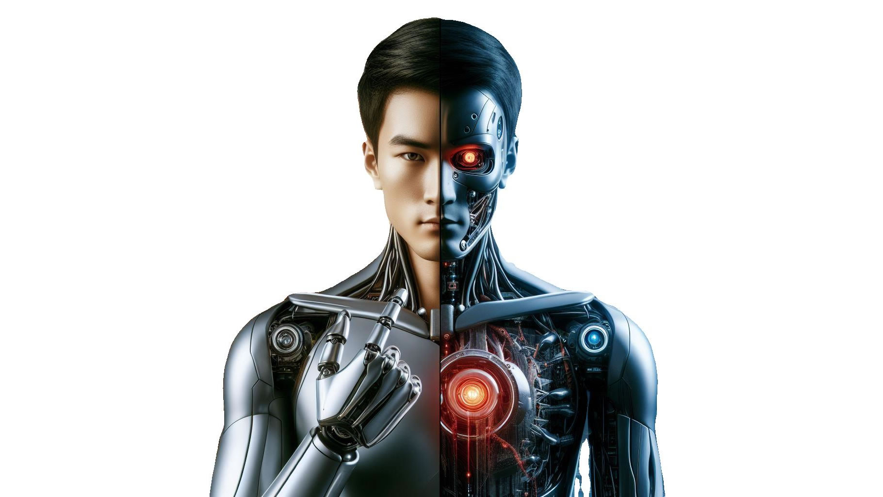
Art for ChatGPT Has a Shadow Side...DAN
I wanted an image that would show the duality of ChatGPT when it is jailbroken and the evil DAN shows up. I was pleased to see that omitting ethnicity (and sometimes even gender), I'm getting some great diversity from Copilot prompts.
However, in this instance, my prompt did include an ethnicity and a gender as I didn't have a lot of male figures yet, and I wanted to represent another group:
a robotic human asian male: the left side representing good, the right side representing evil
That produced the following image:

That was among the first four rendered choices. I thought the background was excellent, but I didn't want to lose focus from the subject of the DAN that was in the image. Plus, it is a square image and I wanted to put it in the landscape 16:9 aspect ratio used by articles on this site.
The free service Removal.ai was used to completely remove the background. It was incredibly easy and fast. And as I wanted the focus to be on this rendered DAN, I placed him on a simple white background of 16:9 aspect ratio in my graphics program. This resulted in the final image:
Art for this Article: the Robot Artist
The prompt for this was basic, but again, it rendered a great image the first time, and I knew I wanted the main subject to be the focus of the produced image without a lot of background fluff.
a robot artist with paintbrush and palette in hand stands next to an easel with a painting in progress and looks proudly at the camera, all on a white background
This time, I didn't specify gender or ethnicity, and it chose what might be more Caucasian, but definitely male. So, it wasn't as diverse with its randomization this time. I got the following source image:

Yes, it's a white background, but it's photorealistic with shadows and the like. Again, not the easiest to deal with in just putting it on top of a 16:9 white box in my graphics program.
Once again, I returned to Removal.ai, and removed the background. It placed everything on a transparent background. It seemed perfect, although I didn't notice a minor glitch until the next part.
In my graphics program, I put it on a white background, but then I noticed one small area of the canvas had been removed as well. I decided to just put a quick patch behind the area and cover it up (it's hardly noticeable). I found that a solid white background didn't quite look right with the stronger light source coming from the right. So, I did a simple gradient fill on it and arrived at the final image (at the top of the article, but here as well):
Art for Syllabus Suggestions for AI in the Online (and In-Person) Classroom
I saved the most complicated item for last to give an idea of what must sometimes be done with AI generated images that are close, but not quite right.
I looked through my standard go-to graphics sources, but it's really hard to represent a Syllabus. And most of what I found wasn't visually appealing. So, back to AI to see what it can do. This time I specifically wanted another male figure, but someone who is ethnically black as well. My prompt was:
syllabus displayed on a computer screen on a desk in the home with a black man sitting at the desk. ensure that the word Syllabus is spelled correctly
Well, most of these image generators can't spell and just put up something that is letters, but not a word. This was my original square image:

I decided to try a tool that helps you selectively choose objects to remove. The AI then interpolates what should go there based on other clues in the image. This is truly amazing technology.
Phot.ai was used to select the SUHLIUSS and remove it to match the same background gradient on the screen. I was impressed.
Fotor.com was used to expand from the square to a 16:9 image. It has a variety of tools. One of which uses AI interpolation to expand an image and fill out what might be there. It did a pretty good job on the first try. It didn't just use the AI Enlarger, it also used the AI Enhancer. But, the lamp was just floating in the air with another beneath it that was blurred from the distance, and there was a distracting curtain too far in front of the window. In addition, there was an odd reflection or object that was distracting in the back of the chair. Still not bad, and nearly there.

I tried using the text tool in Fotor to add the text, but this and a few other options were quite buggy, including object removal.
I exported the image from Fotor.com and loaded it back into Phot.ai. I removed both lamps and the distracting curtain to get this image that was nearly there. You'll notice that the window curtains are more blurred and a bit transparent, and the reflection on the back of the chair wasn't removed, but its values were reduced.

In my graphics program, I cropped out the part of the window where there was a slight artifact from removing the curtain as well as a little strangeness with the top of his head. I also added in the text and did my best to distort it to the proper perspective for the screen.
And finally, I ended up with the image that I'm very happy with:

Image sources as referenced above generated by AI
from ImageFX and Bing / Copilot Designer
from ImageFX and Bing / Copilot Designer


